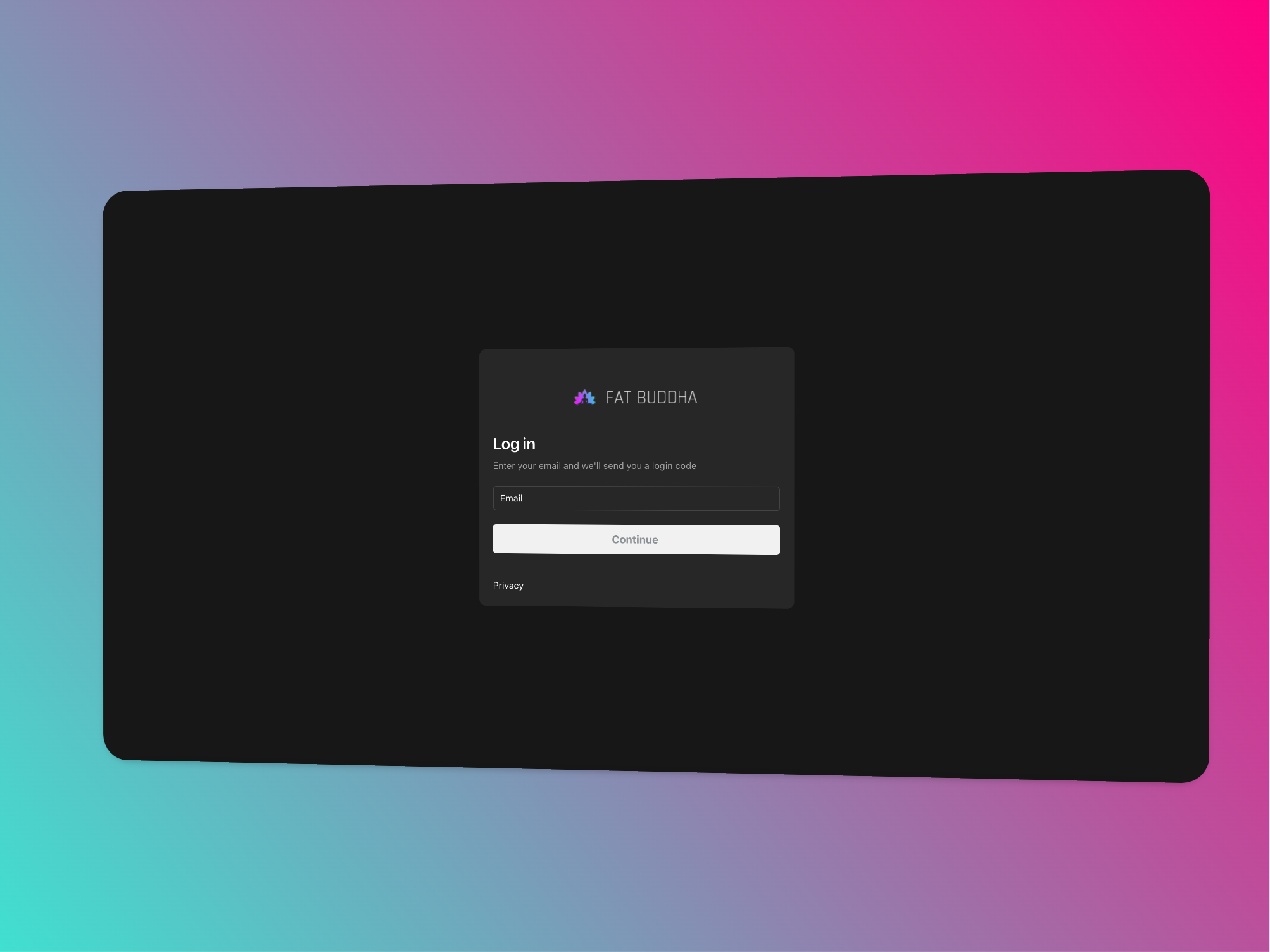
If you’re running a Shopify store, this new feature allows you to edit the login page’s button to match the same colour as your checkout button. This may sound like a small tweak, but consistency in branding helps build trust and a seamless experience for your customers. Let’s dive into how you can customize this new element and keep your store’s design consistent.
Why This Update Matters
Shopify’s latest update gives store owners the power to visually align the login page with the checkout page. This is crucial because:
- Brand Consistency: A unified design from login to checkout increases professionalism.
- Trustworthiness: A consistent design reduces friction and fosters trust, making customers feel secure when navigating through different stages of their journey.
- Seamless Experience: A cohesive color scheme creates a smooth, enjoyable shopping experience, making customers more likely to complete their purchase.
Steps to Customize the Login Page Button Colour
Here’s a step-by-step guide on how to apply the same button colour from your checkout to the new customer account login page:
Step 1: Access Your Shopify Admin
First, you’ll need to log in to your Shopify admin dashboard.
1. Go to your Shopify store’s admin panel.
2. From the left sidebar, navigate to Settings.
Step 2: Customize the Checkout Button Color
If you’ve already customized your checkout button colour, Shopify’s new feature will automatically apply that colour to your customer account login page button. However, if you need to change or set the checkout button colour, follow these steps:
1. In Settings, scroll down and click on Checkout.
2. Scroll to the Checkout Style section.
3. Under Button Colours, choose the button color that best matches your brand’s aesthetic.
The colour you select here will now automatically sync with the customer account login button, ensuring that both areas have the same style.
Step 3: Preview Your Changes
Once you’ve set the button color, it’s always a good idea to preview the changes to ensure everything looks perfect.
1. Click Save at the bottom of the page.
2. Head over to your storefront and go to the Customer Account Login page.
3. Check that the login button matches the colour you set for your checkout button.
Best Practices for Button Design
When customizing your login and checkout buttons, consider the following design tips to maximize user experience:
- Contrast is Key: Make sure the button colour contrasts well with the background so it’s easily visible.
- Stay on Brand: Stick with colours that are aligned with your overall brand identity.
- Test for Accessibility: Ensure the colour choices are accessible, meaning they can be clearly seen by all users, including those with visual impairments.
With Shopify’s new feature allowing you to customize the customer account login page button colour, you can now create a more cohesive shopping experience for your customers. By matching the button colour with the one used during checkout, you enhance both the visual appeal and functionality of your store. This small but effective tweak helps build trust, which is vital for increasing customer satisfaction and conversions.
Take full advantage of this update by ensuring that every element of your store is aligned with your brand’s unique aesthetic!
By customizing your Shopify store’s design, you’re creating a seamless experience for your customers—one that reflects your brand’s professionalism and dedication to user experience.




Share:
The Benefits of AI - SEO Rank Tracking for Your Shopify Website
The Benefits of Using Heat Maps on Websites (And Why Microsoft Clarity is a Great, Free Option for Shopify Users)