Colour is a powerful tool in web design. It has the ability to evoke emotions, convey messages, and create a cohesive visual experience for users. Understanding the basics of colour theory and how to apply it effectively can elevate your web design projects and make them more engaging and effective. In this post, we'll delve into the essentials of colour theory and explore how different colour schemes can be used to influence user perception and behaviour.
Basics of Colour Theory
Colour theory is the study of how colours interact and the visual effects of specific colour combinations. At its core are the colour wheel, primary colours, secondary colours, and tertiary colours.
- Primary Colours: Red, blue, and yellow. These colours cannot be made by mixing other colours.
- Secondary Colours: Green, orange, and purple. These are created by mixing two primary colours.
- Tertiary Colours: These are made by mixing a primary colour with a secondary colour, resulting in hues like red-orange or blue-green.
Colours also have properties that define their visual impact:
- Hue: The shade of the colour.
- Saturation: The intensity or purity of the colour.
- Value: The lightness or darkness of the colour.
Understanding these properties helps in creating a balanced and visually appealing design.
Applying Colour Theory in Web Design
In web design, colour theory is used to create harmony and contrast, direct user attention, and evoke emotions. Here are some fundamental principles and examples:
Colour Harmony
Colour harmony involves combining colours in a way that is pleasing to the eye. There are several methods to achieve this:
1. Analogous Colour Scheme: Uses colours that are next to each other on the colour wheel. This scheme is harmonious and often found in nature. It's great for creating a serene and comfortable design. For example, a website with a green, yellow-green, and yellow colour scheme can feel fresh and inviting.
2. Complementary Colour Scheme: Uses colours that are opposite each other on the colour wheel. This creates a vibrant look with high contrast. For example, a design with blue and orange can be energetic and dynamic, making it suitable for call-to-action buttons or areas where you want to draw user attention.
3. Triadic Colour Scheme: Uses three colours that are evenly spaced around the colour wheel. This scheme offers a balanced and colourful look. For instance, a website using red, yellow, and blue can feel lively and balanced, making it ideal for children's websites or creative portfolios.
4. Monochromatic Colour Scheme: Uses variations in lightness and saturation of a single colour. This creates a cohesive and elegant look. For example, a monochromatic blue scheme can give a professional and calming effect, suitable for corporate websites or healthcare services.
Emotional Impact of Colours
Different colours evoke different emotions and reactions. Understanding these associations can help you choose the right colours for your website’s purpose:
- Red: Often associated with energy, passion, and urgency. It's a powerful colour that can stimulate excitement, making it ideal for sale banners or urgent notifications.
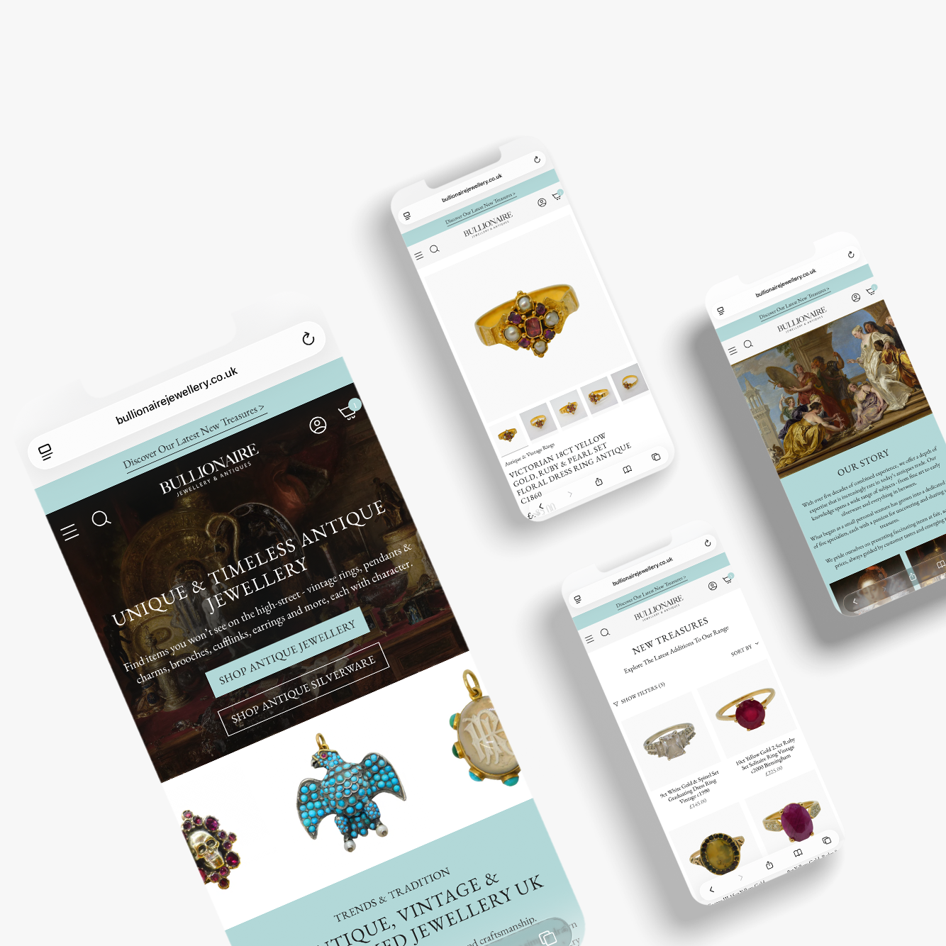
- Blue: Conveys trust, calm, and professionalism. It's commonly used by businesses and healthcare providers to create a sense of reliability and security.
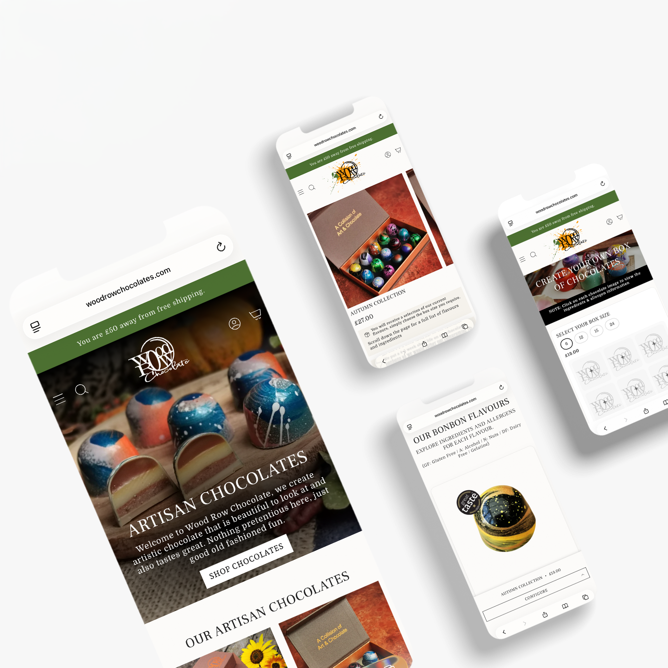
- Green: Represents growth, tranquility, and health. It’s perfect for environmental organizations, wellness brands, and finance websites.
- Yellow: Evokes happiness, warmth, and caution. It can be used to grab attention without being as aggressive as red. Ideal for highlights or encouraging optimism.
- Purple: Associated with luxury, creativity, and wisdom. It’s often used in beauty products, luxury brands, and creative industries.
- Orange: Combines the energy of red and the happiness of yellow. It’s associated with enthusiasm and excitement, making it great for call-to-action buttons and playful brands.
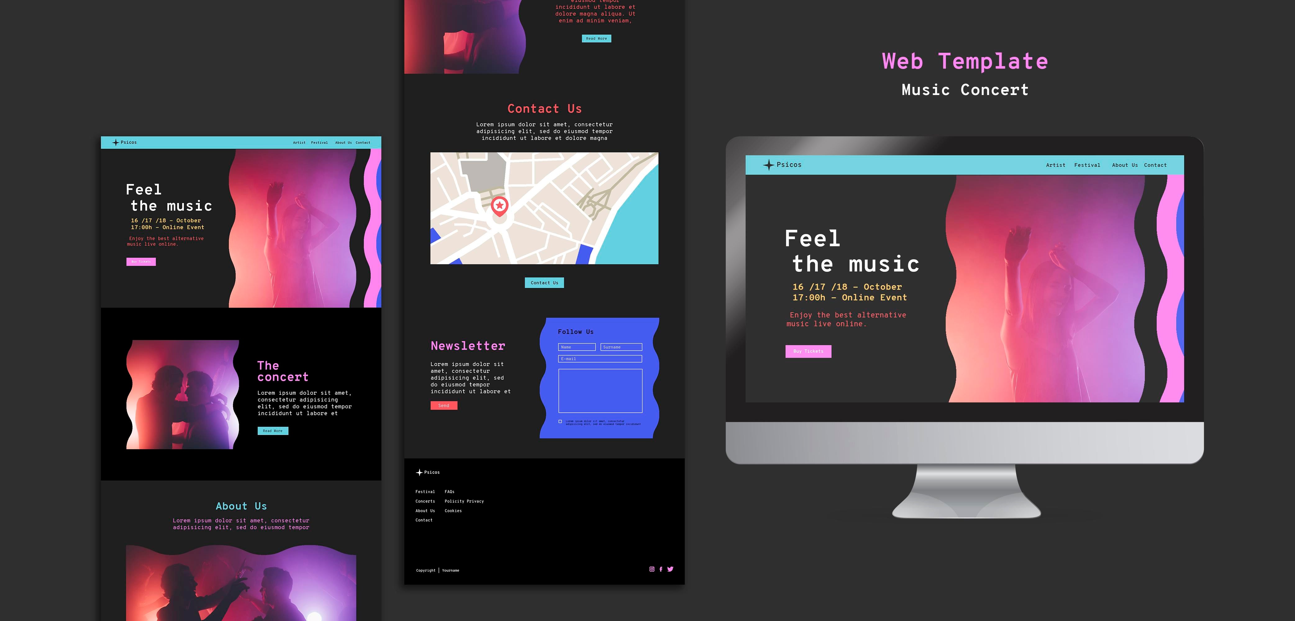
- Black: Conveys elegance, sophistication, and power. It’s suitable for luxury brands and modern, minimalist designs.
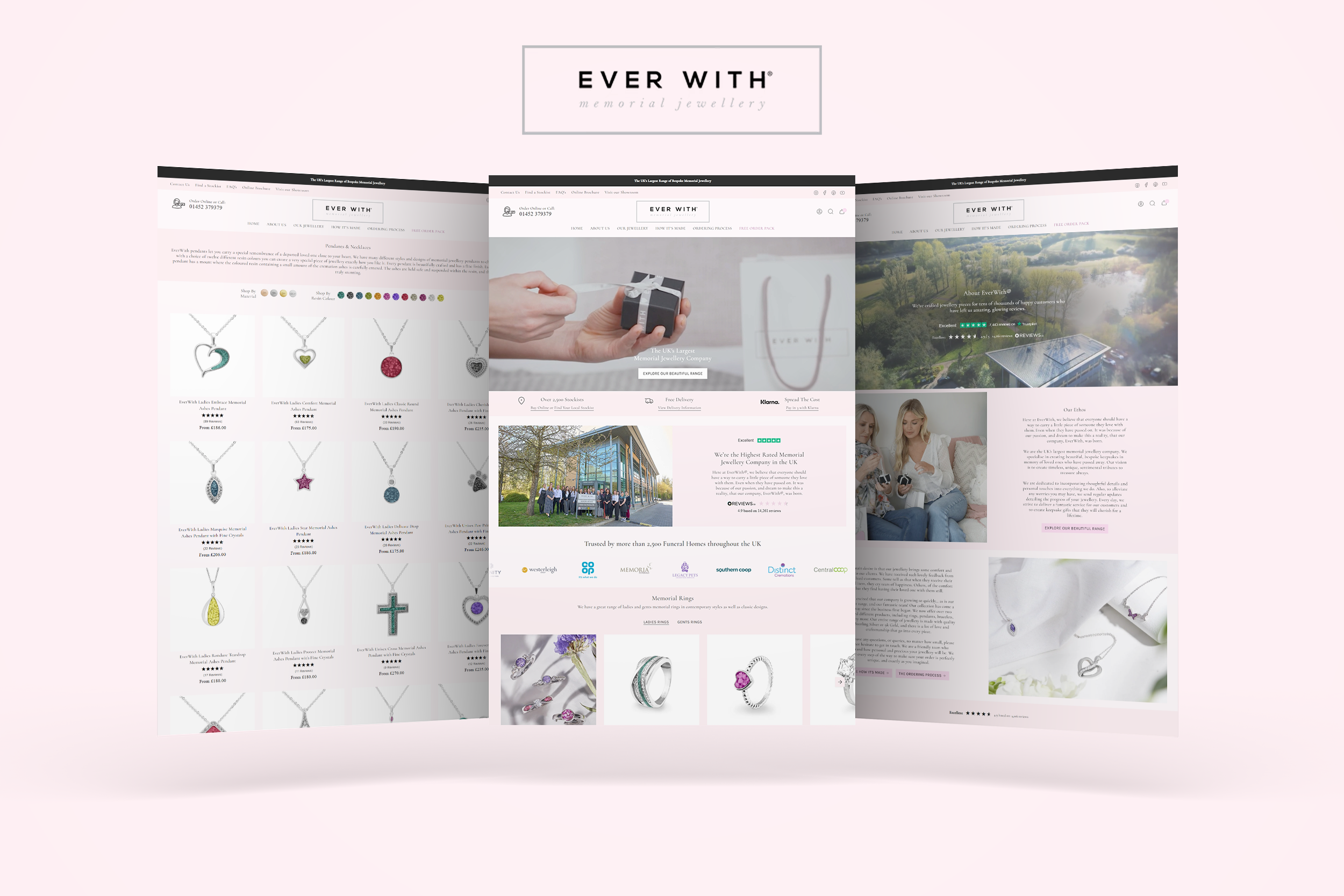
- White: Represents purity, simplicity, and cleanliness. It’s widely used for backgrounds to ensure content is easily readable and to create a minimalist look.
Examples of Effective Colour Schemes
1. Eco-Friendly Blog:
- Scheme: Green (primary), brown (accent), white (background).
- Emotion: Promotes a sense of nature, health, and sustainability.
- Use Case: Green for headers and navigation, brown for buttons, white for background to keep it clean and readable.
2. Tech Startup:
- Scheme: Blue (primary), light gray (secondary), orange (accent).
- Emotion: Trust and professionalism with a touch of excitement.
- Use Case: Blue for the main sections, light gray for backgrounds, orange for call-to-action buttons.
3. Luxury Brand:
- Scheme: Black (primary), gold (accent), white (contrast).
- Emotion: Elegance, sophistication, and exclusivity.
- Use Case: Black for the main background, gold for accents and key elements, white for text to ensure readability.
Conclusion
Applying colour theory in web design is more than just picking colours that look good together. It’s about creating a visual language that communicates the right message and evokes the desired emotions from your users. By understanding the basics of colour theory and experimenting with different colour schemes, you can create visually appealing and effective designs that resonate with your audience.





Share:
How to get your Shopify products on Google Shopping for free
The Benefits of AI - SEO Rank Tracking for Your Shopify Website